Thursday, December 20, 2012

Panning

One Person Walking

I was in front of the school when I took this photo. Taking this photo, I couldn't get him in focus. This shot was my best representation of the skill because the boy was in focus and the background was blurred. Before getting this shot, I just switched the shutterspeed from 1/25 to 1/30. This picture could be improved by making the boy more crisp.
 

Multiple People Running

 I was in front of the school when I took this photo. Taking this photo, I had problems getting the people in focus. This was my best representation of the skill because I got the girl in focus. I kept the same settings I used for my other photos. The clarity of the people could stand out a lot more.
 

Vehicle Moving

 I was in the very front of the school when I took this photo. With this photo, I had problems panning correctly, the car is at an angle when it should be directly in front of me. This shot was the best representation of the skill because the car is in focus and the background is blurred. Plus, the smart car is cute. Before this shot, I was changing the shutterspeed from 1/25 to 1/30, it changed the lighting. This photo could be improved by the car being in front of me, and not at an angle.


Vehicle Moving #2

I was in the teacher parking lot when I took this photo. The only problem I ran into was trying to get the whole car into the photo. This was the best representation of the skill because you can clearly see Mr.P, his coffee cup, and the cart, while the whole background is blurred. I just messed with the shutterspeed for this photo. To improve this photo, the whole cart would have to be in the shot and it would be directly in front of me and not at a slight angle.

Wednesday, December 12, 2012

Shutter Speed Exercises

Stop Action: Dropping/Falling Items

1.I was near the 400 building when I took this photo.
2.While taking this photo, Victoria had to keep throwing the leaves in the air just so I can get a crisp photo of the leaves. That became a problem because she got tired of throwing leaves.
3.This shot best represented the skill because it captures the leaves before they hit the ground.
4. Before this shot, I tried multiple shutter speeds and ISO ranges.
5. An improvement in this photo would be the brightness of the entire photo.

 Motion Blur: Running

 1. In this photo, Victoria and I were in front of the media center.
2. Some problems in this photo were finding the right shutter speed to make sure Victoria became blurry.
3. This was the best representation of the skill because of the blur that was created.
4. Before this shot, I kept changing the ISO.
5. The brightness of this photo could be improved. A better background would be an improvement as well.

Stop Action: Jumping

 1. I was next to the Q-Hut when I took this photo.
2. I didn't run into and problems with capturing the photo. My settings seemed perfect for this action. The only problem was the fact that Victoria had to jump off of benches a lot.
3. This was the best representation of the skill because I captured Victoria in the air.
4. Before taking this photo, I changed the shutter speed and F stop a couple times before I got the right setting.
5. An improvement in this photo would be to get better lighting.

Motion Blur: Action

 
1. I was in front of the Office when i took this photo.
2. A problem I ran into while taking this photo was the lighting.
3. This was the best representation of the skill because he is blurred.
4. Before taking this photo, I changed the ISO multiple times.
5. An improvement in this photo would be a better blur and a better background.

Stop Action: Running

 
1. I was by the vending machines when I took this photo.
2. A problem taking this photo would be getting the right setting for the shutterspeed and ISO to balance.
3. This was the best representation of the skill because I was able to capture Marco in a running position.
4. Before taking this photo, I had to mess with the ISO.
5. An improvement in this photo would be a better background. 

Thursday, October 25, 2012

Framing

Man-made

This photo works because the yellow squares frame my sisters` faces.

This photo works because the fence is framing the red cone. The fence is really blurry, so it draws all of the attention to the cone.

Architectural

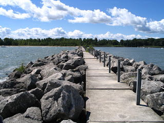
In this photo, the poles are framing everything that's in between. Giving the scenery all of the attention.


In this photo, the walls frame the leaves. I really love the contrast of the bright green leaves on the dull colored cement wall.

Natural

This photo works because the branches frame its own leaves and whatever those round things are.

In this photo, the trees frame Vicky (:

#2. The most challenging element of this assignment wasn't necessarily finding the frames, but something that is going to be framed. I overcame this challenge by looking for frames and hoping that it was going to frams something. I gave up after a while and purposely put something within the frame.


Tuesday, October 16, 2012

Pattern

Man-Made

This photo works because of the repetition of the windows & the blinds behind the windows. While I was taking the photo Adrian stuck his hand through the blinds, so it breaks both patterns.

With this photo, the repetition of the rectangle, and the lines that separate the rectangle create a pattern. I took this photo from above, showing the shape and clarity of the pattern.

Natural

In this photo, the color and repetition of the palm tree prawns create pattern. The diagonal lines create a sense of stability and intensity.

The repetition and the shades of brown create the pattern. The green parts sprouting from underneath the leaves break the pattern. I took the image by getting up close and filling the frame, revealing the pattern of the leaves.

Improve

For this image, my goal was to make the red and white lines stand out. The words in blue and yellow seem to take away from the red and white lines. To improve this photo, I would probably take different shots from different angles to see if it would make a difference where the red and white lines are the focus of the photo.

Well

The skill that I'm doing well in is having more of an open mind and looking at things differently. This is a photo of white paint (I think) splattered on the floor. Usually I don't think I would look at this as a pattern, but more ass a mess on the concrete.

For our next project, my goal is to keep an open and creative mind. I plan to keep taking photos of things people won't usually pay attention to.


Wednesday, October 10, 2012

Angles

Above

This is my strongest shot, it's strong because of the sharpness and I love the shadow on the dirt. It also makes it look like he's walking away.

Below


Straight


Composition

This is my example of leading lines. The lines on the bench leads to Bone (the character). I took this photo by placing Bone at the end of the bench and getting a close-up of the bench to lead to Bone.

Improve

In this photo, I need to get a better lighting. The light from outside makes Bone look blurry because he is white. For my improvements I plan on taking more photos from different angles to experiment with the lighting.
The most challenging part of this assignment was taking photos of different angles on such a small character. The lighting was also an issue as well. The color of bone reflects light and makes him look blurry.

Friday, October 5, 2012

Lines

Diagonal


Horizontal

I believe that this is my strongest photo. It's strong because it has a variety of lines, horizontal, vertical, and diagonal. The monkey bars would be the structural lines in the photo, I got up on the bars to take the picture (: An environmental line would be the horizon line that the trees in the back create.


Vertical


The most challenging part of this assignment was finding ways to make the lines look interesting. After a while i wasn't so focused on making it look interesting, I just started to take pictures of every line I saw and hoped that the picture would come out cool. As of right now, I don't think that Mr. Pederson needs to do anything to improve my experience. One thing I can do to improve my experience is to open my mind & be more creative with my photos.

Wednesday, September 26, 2012

Before & After

For these photos I just played with the brightness/contrast to bring the colors out and used a highpass filter to sharpen the image. I am not spposed to correcting an image, just as long as the changes aren't too drastic.

Before & After


For these photos I decided to change the brightness and contrast to bring out the color of the leaves and the branches. I also sharpened the photo so that the detail in the branches would show. I believe the adjustments I made to this photo change & enhance it drastically.  

Thursday, September 20, 2012


Fill The Frame

I chose this photo because of the detail in the flower.


Leading Lines

I chose this photo because I thought it was a creative way to show leading lines.


Rule of Three


I chose this photo because I like the contrast of the flower on the wood.