Thursday, April 11, 2013

Float


My inspiration was to make it look like someone was hanging. Some technical challenges I faced was making sure that I shot the photo at a time where it doesn't look like he's trying to jump. I resolved this by taking multiple photos. Some artist challenges I faced was trying to edit in photoshop, the sky was completely washed out.

 
I didn't have an inspiration here. I just thought of the idea and went through with it. Some technical problems I ran into was trying to keep the camera completely still. To resolve it I made sure that I worked quickly. Some artist challenges I faced was fixing the color of the sky. The original photo had a lighter sky than the photo with the boys.

 
My inspiration here was the whole "meditation" method. Some technical problems I ran into was again, keeping the camera still. Even on the tripod, it tended to move slightly. If I didn't have such a busy background I wouldn't have worried so much. Some art problems I had was brightening up the photo without over doing it.  


Thursday, March 21, 2013

Poses

Tall

 Location: In front of the 400 building
Problem(s): Finding the right lighting
This photo stood out because Marco looks dominant. What could be improved is the angle that I took the photo from, I should've got lower, and the lighting.

Location: Under the umbrellas
Problem(s): Finding the right lighting, the pictures I take are always super bright.
This photo stood out because Karinas legs are elongated, making her look tall. What could be improved is the lighting and the background of the photo.

Seated


Location: Near the attendence office
Problem(s): Lighting
This phoro stood out because I like the way Marco is sitting. It looks casual. Something that could be improved is the background and the brightness of the photo.

Location: By the umbrellas
Problem(s): Lighting
This photo stood out because she looks like she's just chilling. Like she wasnt' trying to pose. Something that could be improved in this photo is the shadows. The shadows on her face make her look darker.

Lean

Location: Next to the 200 building in the front of the school
Problem(s): The shadows from the tree
This photo stood out because of the way I took it, I like how it's zoomed in, rather than showing his entire body. I also think that the shadows on his face from the tree add to the photo, even though it looks like he has a mask on.

Location: Next to the 200 building in the front of the school
Problem(s): Finding the right angle to take the photo from, so that the shadows fromt he trees didn't look to funky.
This photo stood out because It was better than the photos I took of Karina. To improve this photo, I would try to add more light to his face.

Environmental

Location: Near the vending machines
Problem(s): The prop didn't really define him
This photo stood out because of the crispness. To imporve this photo I would've tried to find better light.

Location: Next to the attendance office.
Problem(s): The prop didn't define Karina's personality
This photo stood out because she looks like a pro tennis player. I like the lowkey depth of field as well. Something to improve this photo would be to make the colors more vibrant.

Wildcard


Location: Near the vending machines
Problem(s): Finding the right lighting
This photo stood out because it makes me laugh every time I look at it. Something that can be improved in this photo is the gloomy-ness.

Location: Near the vending machines
Problem(s): The lighting of the photo is very washed out
This photo stood out because of the facial expression Karina made. To improve this photo I would try to get rid of the gloomy background.


The most challenging part of this assignment was finding the right lighting for my photos. To resolve this problem I need to choose better locations with better lighting. I also need to take more of a variety of photos, so I'll have more to choose from. My photography skills increased a lot. The knowledge I gained from this class is very helpful. I never used to pay attention to f/stops or shutter speeds before I took this class. Before the end of the year I would like to learn about anything you're going to teach. (:

Friday, March 1, 2013

Vermeer


With shooting portraits of someone else, I had problems with the right lighting. The challenge of being a model is trying not to look weird and being camera shy. I think that being open and having social skills makes a good photographer.

Tuesday, January 29, 2013

Photo Analysis: Portraits

Studying the photo, I realized that the yellows were brought out. The sun shining through the doorway makes the photo really bright. The woman's white dress reflect the light. From this photograph, I can assume that it is her wedding day.

 Studying this photo, I can tell that the baby is excited. It looks like she is hitting herself in the jaw. I can also tell that the background is pure white. The baby looks more shocked than anything. I would like to know why the baby is so shocked.

Studying this photo, I can tell that she is distressed and something is wrong. You can tell that she is tired of something. There is no background, the photo is completely filled with her face. The color of her scarf reflects in her eyes, making her eyes look like they're a different color. I would like to know what is wrong with her.

Studying this photo, you can tell that this beautiful man is posing. There's a good amount of light on his face. You can tell that there is shallow depth of field being used. I think the background is a wall, or a fence. There is nothing I would like to know.

Studying this photo, I can tell that this old man has a sense of humor. You can see all of the detail in his face, like all of his wrinkles. I can assume that this old man is happy with his life. I would like to know how old he is.

Friday, January 18, 2013

DOF Photo Corrected


In this photo I adjusted the levels and brightness and contrast. The adjustments brought out the color of the rust, I think the brightness is to high. I feel that making these types of adjustments to my photos is helpful. 


 In this photo, I adjusted the levels. The adjustments I made to the photo brought out the dark parts. Making these types of adjustments to my photos are helpful. 

  
I adjusted the levels in this photo. The adjustments I made brought out the darker colors in the photo. Making these types of adjustments to my photos makes it look better. 


 In this photo I adjusted the levels and contrast. The adjustments I made, slightly brought out the color of the peach ring. Making this type of adjustment to my photo enhanced the coloring. 


In this photo I made slight adjustments to the levels and brightness. The adjustments I made to this photo brought out the redness of the leaf. Making this type of adjustment to my photo made it slightly darker. 


 In this photo I made adjustments to the levels. The adjustments I made to the photo brought out the shadows more. Making this type of adjustment to my photos creates a darker and sharper shadow. There is nothing I would like to fix in ant of my photos that I don't know how to do already. 

- Shallow depth of field focuses on an object in an image and large depth of field focuses on multiple parts of an image, if not, the entire image. I didn't switch from TV mode to AV mode at all when taking my pictures, only because I didn't mess with the shutter speed in TV mode. The hardest part of the assignment was finding the right distance between the focal point and a background that will create the "boca effect" in my photos. 


Wednesday, January 9, 2013

Depth of Field


This photo has shallow depth of field. The focal point is the dandelion. This demonstrates shallow depth of field because the flower is in focus and the background is blurred. I think the photographers purpose was to show all of the detail in the flower. 

This photo has shallow depth of field. The focal point in this image is the group of mushrooms in the front. This demonstrates shallow depth of field by some of the mushrooms being in focus and the rest are blurred with the background. I think the photographers purpose was to create a more interesting photo. 
 
This photo has shallow depth of field. The focal point of this image is the swirl. This demonstrated shallow depth of field by the swirl being in focus and the background is blurred. I think the photographers purpose was to create contrast between the purple swirl and the green background. 
 
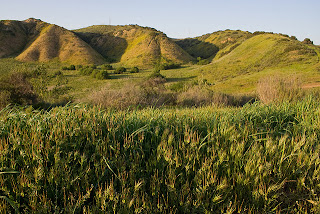
 This photo has large depth of field. The focal point of this image is the entire scenery. This demonstrates large depth of field by the whole photo being in focus. The photographers focus was to create an interesting photo by focusing on the entire scene instead of just one object. 

 
 This photo has large depth of field. The whole scenery is the focal point. Large depth of field is demonstrated by the entire photo being in focus. The photographers focus was to make sure that the entire scene is in focus. 
This demonstrates large depth of field. The landscape is the focal point. Large depth of field is demonstrated by the entire photo being in focus. The photographers focus was to concentrate on the whole landscape.
 

Monday, January 7, 2013

End of the World

This is my best friend (Besfraan) Iyana Thomas. I want her to survive because she's always been there for me and we always have a good time when we're together. If she died, I would just die with her. She's been welcomed into my family and she's like my sister. I love her. 
 
 
This lunch court deserves to survive because Iyana and I will need food to survive. We can also use it for shelter. The only thing it doesn't have is a bathroom. 

 These carts deserve to survive because Iyana and I will need a form of transportation.